


Introduction
I recently learnt how to carry out cohort retention analysis in Tableau.
But most of the articles I came across were just using Tableau merely as a visualisation tool for the cohort retention rate results. For example, they'd use SQL for calculation and then Tableau for visualization or use Excel for calculation and then visualise in Tableau.
I found there's an efficient way to do all this. Calculating the cohort retention rate and also visualizing the results all in one place -- Tableau. Isn't that awesome?
In this article, you'll learn :
What cohort retention analysis is
Why it’s important
What data is required for cohort retention analysis & if it’s not available, how to calculate it (derived columns/calculated field)
How to create the cohort retention table
How to interpret the cohort retention rate
Prerequisites
You should have a Tableau public account to be able to create and publicly share your visualisation after you're done.
You should know the basics of Tableau. In this article, I assume you're already familiar with the Tableau environment. I'll focus on teaching you how to use Tableau for cohort analysis specifically.
Understand cohort retention analysis
Cohort analysis is used by businesses to understand the behaviour, patterns and trends of their customers so that they can subsequently tailor their products and services to the identified cohorts.
You might ask yourself what a cohort is. A cohort is simply a group of people in this case who are customers, that share common characteristics such as time and size. Therefore, Cohort Analysis is an analysis of several different cohorts to get a better understanding of their behaviour, patterns, and trends.
There are different types of cohorts to analyze. They include:
Time-based cohorts
Segment-based cohorts
Size-based cohort
In this case, the type of cohorts you are going to create are time-based cohorts. Specifically, the cohort analysis you're going to do is retention-based. You are going to look at the time frame a certain group of people made their first purchase and then track the percentage of them that made subsequent purchases in future quarters.
Get Data
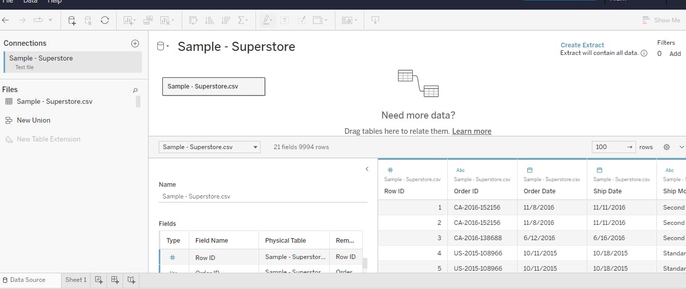
The Data set that you are going to be using is the famous Superstore Dataset. You can access the dataset by downloading it from Kaggle.
Open Tableau Public and connect to the Superstore data.
Go ahead and analyse the rows and columns to know what kind of data about the superstore was documented.
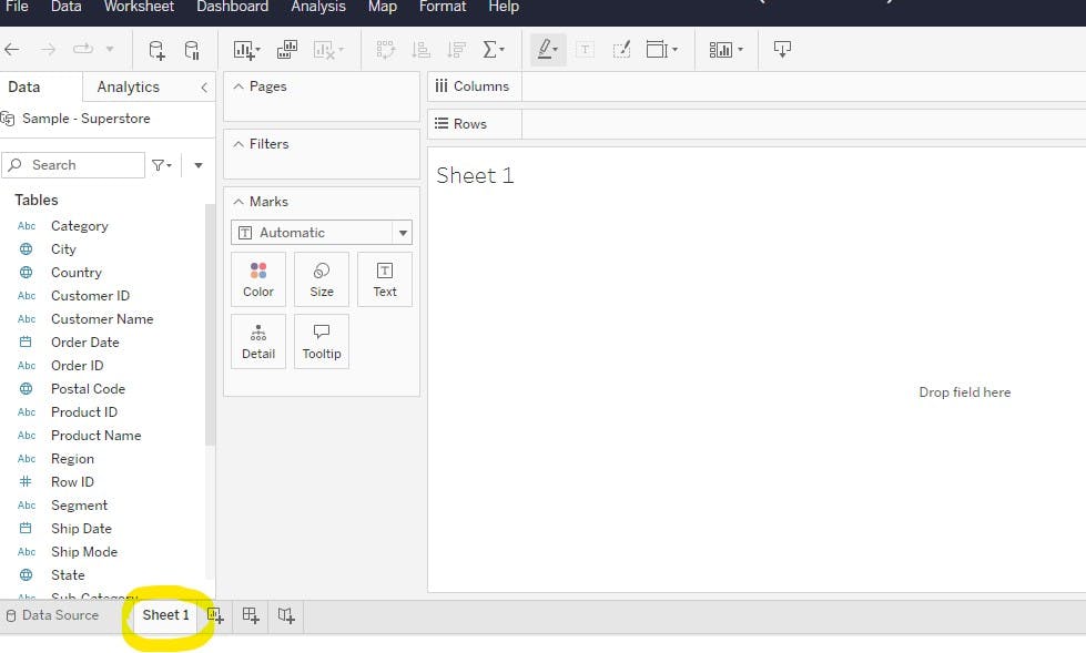
Proceed to the Sheet 1 tab. This is going to be your workspace and where you're going to subsequently create your visualisation.
Begin Cohort analysis
Data points of interest
To carry out cohort analysis the following data points are required. You need:
Unique identifier. In this case, your unique identifier is the
Customer IDFirst purchase date. This refers to the date the customer made their first purchase from the business and became a customer. This initial date is going to come in handy in creating a cohort group.
Revenue data
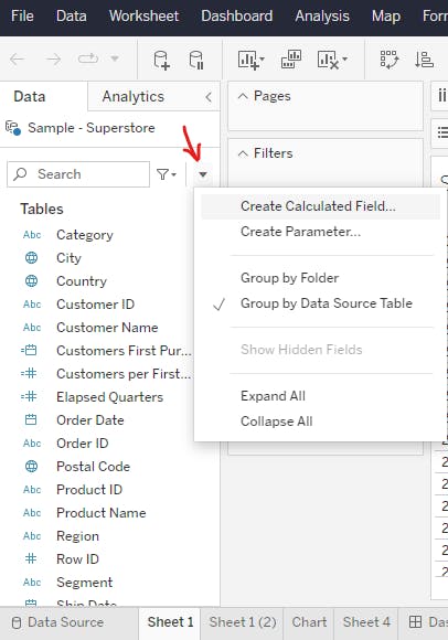
Create calculated fields
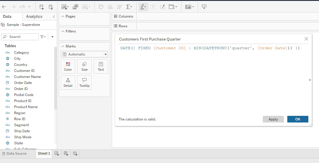
Customers' First purchase date(quarter)
As mentioned earlier, the first purchase date is used in assigning a cohort to each customer.
Since the first purchase date field is not readily available in the data set. You are going to come up with it. This is known as a calculated field. A calculated field is a numeric or date field that derives its data from the calculation of the data in other fields that are readily present in the dataset.
Through the 'first purchase' calculated field, you're going to create quarter and year cohorts which will be assigned to customers depending on the date they made their first purchase
Earlier in this article, I defined a cohort as a group of people that share common characteristics like time. In this case, a cohort is going to be a group of customers that made their first purchase in the same quarter and same year.
If you explored this Superstore dataset at the start, you might have realised that this data is spanning four years (2014-2017), if decided to make the month cohorts, it would make the cohort table very big and hard to analyse at just a glance. So I deemed it efficient to form cohorts based on the quarter and year in which a customer made their first purchase. What I'm trying to say is that you can create time-based cohorts based on other time parameters like day, week or month and it wouldn't matter.
The calculation to establish the quarter in which a customer made their first purchase is as below:
DATE({ FIXED [Customer ID] : MIN(DATETRUNC('quarter', [Order Date])) })
Customers per first quarter
This calculated field is going to be used to establish the number of 'unique' customers that made their first purchase in each quarter.
This calculation builds on the first calculated field that you've just completed.
{ FIXED [Customers First Purchase Quarter] : COUNTD([Customer ID]) }
Retention Rate
COUNTD([Customer ID])/SUM([Customers per First Quarter])
Assemble the cohort table
This is about assembling the calculated fields you've created to form a cohort retention table.
Click on
Customers First Purchasefield and drag it to the rows.On the rows, click on the drop-down, then switch the specifications from year to quarter and from continuous to discrete.
Click on the
Order Datefield and drag it to the columns. Click the drop-down in the columns to switch the specifications from year to quarter and from continuous to discrete.Drag the
Customers per first quarterfield you created from the measures to the dimensions. And then drag it to the rows.Click the
Retention Ratefield you previously created and drag it to the text tile. Click the drop-down to format number to percentage of one decimal place.Drag the
Retention Ratefield from the text tile to the colour tile. Then dragCustomer IDfield to the tooltip tile. On the customer ID tool tip, click the drop down to change from attribute to a measure of count distinct. Then finally make the values visible by clicking T on the tool bar.You can further customize the look of the table by going over to the coolors website to pick out some unique colours that appeal to you.
Interpret the retention rate
Going down the view
Going down the view of the cohort table, look at the first column and second column, you see
different year and quarter groups (cohorts)
the number of customers that made their first purchase in each of those periods.
Going across the view
Going across the view (3rd column), you see the percentage of customers that continued to make purchases at the superstore 0 through 15 quarters after making their first purchase.
For example, 160 customers made their first purchase in 2014 Q2. Of those 160 customers, 24.4% and 36.3% of them came back to make purchases in 2014 Q3 and 2014 Q4 respectively. And so forth...

Conclusion
Creating calculated fields is inevitable in carrying out Cohort analysis in Tableau. And with creating calculated fields comes the need to use functions. If you are fairly new to the concept of Tableau functions, I understand there might be some knowledge gaps for you to fill. I recommend you check out this Tableau article on functions to gain a deeper understanding of the subject.